Metis Project Benson: MTA Data
April 10, 2015
My first data science project in the Metis bootcamp was a team project, for which I worked with Marco Lunardi, Ha Luu, and Gina Soileau. 
We were given some fascinating and extensive MTA data, and our task was to find and demonstrate some use for it. All in a couple of days. So we brainstormed! What would be a good question to ask, and how would the MTA data help us provide an answer? Our ideas included advising the NYPD on where to station officers, or where and when to schedule backpack searches; advising the city on where to install racks for Citi Bike, and advising a company or a political organization on where to station sign-up teams.
In the end we went with the latter idea. We created a fictional green-energy company called “Blue Sky Energy Corporation”, and imagined that they want to deploy sign-up teams in high-traffic areas across the city to maximize new subscriptions to their green-energy supply service. Among other options, they are considering placing teams near the busiest subway stations.
MTA Data Collection and Cleanup
The MTA provides a website for developers, from which rich turnstile data sets can be downloaded for free. Each data set consists of turnstile entrance and exit counts collected every four hours for one week, at all turnstiles in the subway system. Each record in a data set contains the result of one “audit”: a turnstile’s identification information, a time stamp, and cumulative entrance and exit counts. Here is a more detailed description of each item in one such record:
C/A      = Control Area (a block of turnstiles);
UNIT     = Remote Unit for a station;
SCP      = Subunit Channel Position (designates a single turnstile);
STATION  = Station name;
LINENAME = Concatenation of names of lines going through station (e.g. NQR456, BD,...);
DIVISION = A label with six possible values:
           The first three refer to a time when there were three separate subway systems:
              IRT = Interborough Rapid Transit;
              BMT = Brooklyn-Manhattan Transit;
              IND = Independent Subway;
           The last three are more recent developments:
              PTH = Port Authority Trans-Hudson (PATH);
              RIT = Roosevelt Island Tram;
              SRT = Staten Island Rapid Transit;
DATE     = Date on which data were collected;
TIME     = Time of collection (every four hours);
DESC     = Characterizes the audit event as either:
           REGULAR (normally every four hours), or
           RECOVR AUD (a missed audit that was recovered);
ENTRIES  = State of entries counter at turnstile at given date and time;
EXITS    = State of exits counter at turnstile at given date and time.
The entries and exits counters get reset every once in a while, but not in a predictable way. You detect a reset by noting that a counter’s value at a given time is lower than at the previous time. Some information is lost during a reset, since you can’t tell what the counter values were just before and just after the reset. So these data get thrown out; it’s a negligible fraction of the total entrance and exit counts.
For this project we used MTA data for the week of March 28 to April 3, 2015. This data set contains 191,385 records involving 4,558 turnstiles in 381 stationsWhen identified by name (e.g. “42 ST-GRD CNTRL”, “34 ST-PENN STA”, etc.), the stations in our data set number 381. When identified by unit, they number 463. A station name may be associated with more than one unit, and a unit may be associated with more than one station name. . Outside of resets, turnstile counters simply keep accumulating entrance and exit counts. However we are only interested in numbers of exits and entrances between time stamps. Hence the 191,385 records only contain 191,385 - 4558 = 186,827 useful data points. In addition, we lost 1,096 data points to resets, leaving us with 185,731 clean data points.
Preliminary Conclusions: Busiest Stations and Busiest Days
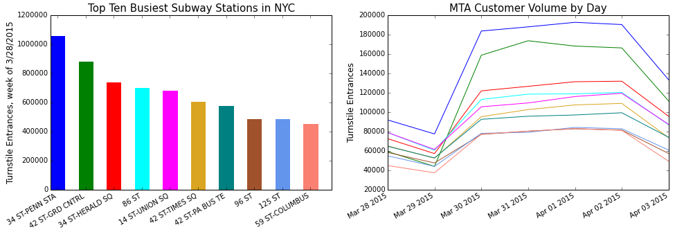
Figure 1 displays information about MTA commuter volume, by station and by day.

The left panel is a bar chart of the ten busiest subway stations in the city. For each of these stations, the right panel shows the commuter volume as a function of day of the week, starting with Saturday, March 28, 2015.
The top ten stations are less crowded on weekends than on weekdays. Hence we can reasonably assume that most of the people using these stations are commuters, not tourists. A green-energy company would of course want to target the commuters. Note also that most of the top ten stations are located in a relatively small rectangle within Manhattan. Their regular users should have a similar profile and targeting them shouldn’t be too expensive.
Further Steps
Our analysis could be refined in several ways: by using the time-of-day component of the MTA data; by identifying stations with low tourist usage; by analyzing the data seasonally, to adjust deployment for changes in energy demand between winter and summer; and by analyzing the largest subway stations in terms of which entrances channel the largest crowds.
Other possible sources of data could also be considered: green market visitors, large outdoor events (marathon, bike tour, Central Park events), street fairs, large retail stores, popular restaurants, and demographic data about city neighborhoods. One could bring on an ethnographer or marketing specialist to profile people most likely to switch to clean energy. And finally, one could design experiments to gather data-informed feedback on sign-ups.
Technical note
This project was essentially an exercise in the manipulation of Python dictionaries and list comprehensions. Dictionary keys were used to group data, first by turnstile, then by station, and list comprehensions were used to transform dictionary values (which were typically lists). The plots were generated with Matplotlib. The analysis code can be found in my GitHub repository.