Predicting Flight Delays with a Random Forest
July 6, 2016
Contents:
1. The airline data set
2. Categorical features
3. Intrinsic discrepancies
4. Fitting Strategy
5. Grid search
6. Classifier performance
7. Technical note
On Sunday June 5 of this year, the NYC meetup group Women in Machine Learning and Data Science organized a workshop on random forests led by Anita Schmid and Christine Hurtubise from OnDeck. They started with a theoretical review of the random forest algorithm, followed with some practical tips, and after that we all broke up into small groups to try our hands on a data set of flight delays. Some of us used Python, others R.
There wasn’t really enough time to complete the analysis during the workshop, so I finished it at home and report the results here.
The airline data set
The data set consists of 100,000 flight records (this is actually a subsample of a large public data set). After some basic cleanupThe cleanup consisted in converting the “Month”, “DayofMonth”, and “DayOfWeek” fields from string to integer, and mapping “DepTime” values larger than 2400 back to the interval [0,2400]. , each record contains the following fields:
Table 1: Features of the airline data set; the last row (dep_delayed_15min) is the response variable; the type column indicates whether a feature is binary (bin), integer (int), or categorical (cat).
| Feature | Description | Type | |
|---|---|---|---|
| 1. | Year | A number between 2004 and 2007 | int |
| 2. | Month | A number between 1 and 12 | int |
| 3. | DayofMonth | A number between 1 and 31 | int |
| 4. | DayOfWeek | A number between 1 and 7 | int |
| 5. | DepTime | A number between 0 and 2400 | int |
| 6. | UniqueCarrier | Two-character airline code | cat |
| 7. | Origin | Three-letter departure airport code | cat |
| 8. | Dest | Three-letter destination airport code | cat |
| 9. | Distance | Flight distance in miles | int |
| 10. | dep_delayed_15min | Y/N flag indicating a departure | |
| delay of more than 15 minutes | bin |
The purpose of the exercise is to construct a predictor of the binary delay variable (“dep_delay_15min”) based on the nine available features. The input data set is unbalanced: 80,726 flights out of 100,000 had no delay.
To gain some insight into the features it is helpful to plot their normalized distributions separately for the “delay” and “no-delay” cases. This is shown below in Figures 1, 2, and 3. Because of their normalization, these plots have a simple statistical interpretation: at any point along the X-axis, the ratio of the two distributions is a likelihood ratio. The top-left panel of Figure 1 for example, indicates that the likelihood of a delay increased from 2004 to 2007.
Several other effects are visible in these plots: delays tend to be more likely during summer months and in December, in the second half of any given month, in the middle of the week, and at the end of the day. Short flights seem less likely to be delayed than long ones. Perhaps the sharpest difference between delay and no-delay is exhibited by the histogram of departure times.
The remaining features are categorical, and their distributions can be represented with bar charts. First the airline codes, ordered alphabetically. There are 23 of them:
Next, the airports of departure and destination. There are 307 of the former and 306 of the latter, so these are long charts. For readability I have chosen to display them vertically, and ordered alphabetically. The main thing one learns from these charts is that some airports are busier than others, and busyness correlates with delays (see for example ATL-Atlanta, EWR-Newark, and ORD-Chicago), but not in a systematic way (DFW-Dallas/Fort Worth, IAH-Houston, and LAX-Los Angeles). Enjoy the scroll down, and I’ll see you on the other side of YUM (Yuma, AZ)…
Categorical features
To prepare the data for the classifier, the categorical features (“UniqueCarrier”, “Origin”, and “Dest”, see Table 1) must be converted to dummy variables using one-hot encoding. Pandas has an easy method for this:
df2 = pd.get_dummies(df1, drop_first=False)
This results in data frame df1, with 9 feature variables, being replaced by data frame df2, which has 642 feature variables! The drop_first=False argument indicates that we do not wish to drop one dummy variable per categorical variableSee for example Galit Shmueli, “The use of dummy variables in predictive algorithms”. . This is only necessary for regression problems, where input multicollinearity is an issue (“dummy variable trap”). For tree-based classification models, removing a dummy variable may actually reduce efficiency.
Intrinsic discrepancies
For future reference I find it useful to summarize with one number the effectiveness of a feature to distinguish between delay and no-delay. A relatively simple, information-based measure to achieve this is the so-called intrinsic discrepancySee for example J. Bernardo, “Reference Analysis”, Handbook of Statistics 25 (D. K. Dey and C. R. Rao, eds.), 17-90, Elsevier, 2005. between two probability distributions and :
For discrete distributions the integrals become sums. After sorting them in decreasing order, the top ten intrinsic discrepancies between delay and no-delay are as follows:
Table 2: Intrinsic discrepancies between the delay and no-delay distributions of the features in the airline data set. The features “Origin_ORD”, “UniqueCarrier_HA”, “UniqueCarrier_EV”, and “Origin_HNL” are some of the dummy variables created by one-hot encoding of the categorical features in the original data set.
| Feature | Intrinsic Discrepancy |
|---|---|
| DepTime | 0.2400 |
| Month | 0.0205 |
| Distance | 0.0114 |
| DayOfWeek | 0.0069 |
| Year | 0.0063 |
| Origin_ORD | 0.0058 |
| UniqueCarrier_HA | 0.0056 |
| DayofMonth | 0.0050 |
| UniqueCarrier_EV | 0.0046 |
| Origin_HNL | 0.0036 |
It is again clear that departure time is by far the most discriminating feature, followed by month and distance. The Chicago airport (ORD) as point of origin is a noteworthy feature by itself, as are Hawaiian Airlines (HA), Express Jet (EV), and Honolulu airport (HNL).
Fitting strategy
When fitting a classifier to training data, an important concern is to avoid overfitting, in order to keep the generalization error under control. This is a measure of the accuracy of the classifier when applied to previously unseen data.
This concern leads to the distinction between parameters and hyper-parameters. Parameters are quantities that are adjusted to fit a classifier to training data, whereas hyper-parameters are used to control overfitting. In the case of a random forest for example, parameters specify what happens at each node of each decision tree, whereas hyper-parameters specify the number of trees and the maximum depth of a tree.
A common strategy to determine the hyper-parameters is to maximize the classifier accuracy, defined as the fraction of cases that are correctly classified. However this is not a good strategy for unbalanced classes, as is the case in the airline data set, where we have 19% “positives” (delayed flights) versus 81% “negatives” (non-delayed flights). To see this, note that accuracy can be written as:
where is the prevalence, the fraction of positives in the sample. Since the recall (the fraction of positives that are correctly classified) and specificity (the fraction of negatives that are correctly classified) are independent of , the above equation shows that accuracy does depend on and is therefore not an intrinsic property of the classifier.
A better measure to maximize is AUC, the area under the Receiver Operating CharacteristicSee for example Tom Fawcett, “An Introduction to ROC Analysis”, Pattern Recognition Letters 27, no. 8 (June 2006), 861–874. (ROC). It is independent of the prevalence and can be interpreted as the probability for the classifier to produce a higher score for a randomly drawn positive than for a randomly drawn negative.
A good fitting strategy, then, starts with a three-fold cross-validated search over a grid of hyper-parameters, and follows with testing on a holdout sample. Here are the steps:
-
Randomly split the entire data set into a training set and a test set, in the ratio of 70% to 30%.
-
Specify a “reasonable” search grid in hyper-parameter space.
-
Using the training set, perform a three-fold cross validation fit at each point of the search grid. Use AUC to determine the optimal point.
-
Refit the random forest to the entire training set, using the hyper-parameter values at the optimal point from the grid search.
-
Evaluate the properties of the fitted classifier on the test set.
In the next sections I describe the grid search and the result of applying the refitted classifier from step 4 to the test set.
Grid search
Scikit-learn provides method GridSearchCV to search a grid in hyper-parameter space for the optimal classifier of a given type in a given problem. In the present case we are interested in a RandomForestClassifier. As was emphasized at the WiMLDS workshop, random forests can and do sometimes overfit. Scikit-learn provides three parameters to control overfitting, and these are the ones I used in the grid search:
-
n_estimators: the number of trees in the forest; more trees reduces overfitting but takes longer to run; I tried the values 50, 100, 200.
-
max_depth: the maximum depth of a tree in the forest; the deeper a tree, the more it risks overfitting; I tried the values 5, 10, 20.
-
min_samples_leaf: the minimum number of training examples in a newly created leaf in a tree; the smaller this number, the higher the risk of overfit; I tried the values 1, 2, 3, 4, 5, 10, 20.
The remaining random forest parameters were set to their scikit-learn default values, except for class_weight, which was set to “balanced_subsample”. Among the grid search parameters, scoring was set to “roc_auc”, which is the AUC defined in the previous section.
The result of the grid search is n_estimators = 200, max_depth = 20, and min_samples_leaf = 2, which yields an AUC of (as obtained by the 3-fold cross validation). There is relatively little variation across the grid, the lowest point having , a 4% difference.
Classifier performance
The grid search was performed on 70% of the total sample. I used the remaining 30% as a test sample to compute the confusion matrix and make summary plots. Here then is the confusion matrix, where I assigned the label “positive” to “flight delay” (since that’s the effect of interest) and the label “negative” to “no delay”:
Table 3: Confusion matrix for the random forest classifier found with the grid search, showing the number of true negatives (tn), false positives (fp), false negatives (fn), and true positives (tp). A 50% threshold on the classifier output is assumed.
| Predicted No-Delay | Predicted Delay | Total | ||
|---|---|---|---|---|
| Actual No-Delay | tn = 15458 | fp = 8747 | 24205 | |
| Actual Delay | fn = 1881 | tp = 3914 | 5795 | |
| Total | 17339 | 12661 | 30000 |
From this matrix we can estimate some of the standard quantities that are used to evaluate the performance of a classifier:
Table 4: Performance indicators for the random forest classifier used to predict flight delays. “Sensitivity” is also known as “recall”, and the two types of precision are sometimes referred to as positive and negative predictive values.
| Sensitivity | (probability to identify a true positive): | 67.5% |
| Specificity | (probability to identify a true negative): | 63.9% |
| Precision | (probability that a positive id is true): | 30.9% |
| Precision | (probability that a negative id is true): | 89.2% |
| Accuracy: | (probability of a correct identification): | 64.6% |
All the above numbers are relative to a 50% threshold on the output of the classifier. Here is how this output is distributed, separately for delayed and non-delayed flights, in the training and test samples:
The histograms are centered around 50% because I set the parameter “class_weight” to “balanced_subsample” in scikit-learn’s random forest classifier. Had I not done so, the histograms would have been centered around the fraction of positives in the dataset, which is about 20%, and all bins above 50% would have been empty. As a result the precision and sensitivity would have been zero, and the specificity 100%, due to the 50% threshold on the classifier output.
For predicting flight delays, thresholds other than 50% can be chosen from the left panel of Figure 5. The queue rate is the fraction of instances that pass the threshold cut. As the threshold increases, fewer true positives pass the cut, leading to a decrease in recall that follows the decrease in queue rate. On the other hand the purity of the sample of instances passing the cut increases, as shown by the precision curve.
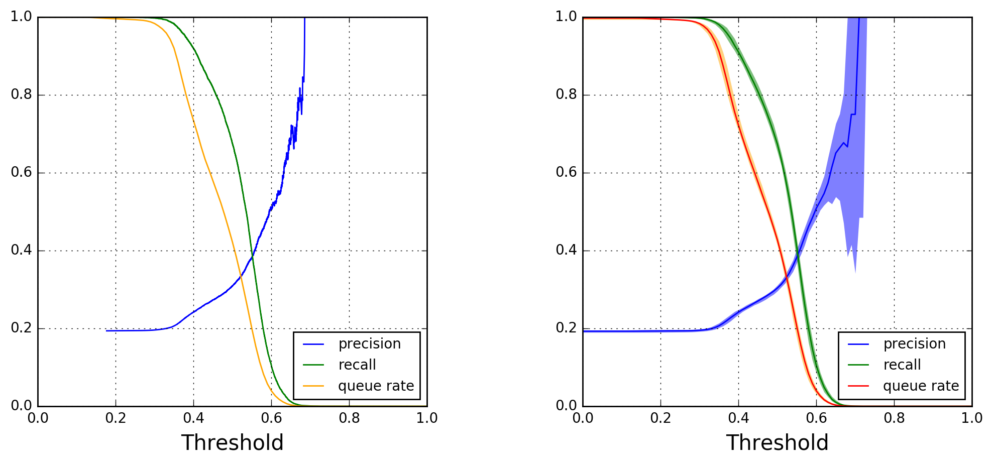
Note how the precision curve in the left panel becomes more jagged for thresholds above 0.60. This is due to a lack of statistics, as can be inferred from the right panel of Figure 4. To explore the variability of the precision, recall, and queue-rate curves as a function of threshold, I generated independent random forest models from 50 different random splittings of the original data set into training and test subsets (still maintaining a 70/30 ratio). I used this ensemble of models to compute and draw median curves and 90% confidence belts, which are shown in Figure 5’s right panel.
The confidence belts are generally quite narrow, the only exception being the precision curve for thresholds above 0.60. This type of plot can be used to guide business decisionsFor a nice introduction to thresholding, see this blog post by Slater Stich, “Visualizing Machine Learning Thresholds to Make Better Business Decisions”. .
As mentioned earlier, our random forest classifier uses 642 features (after converting categorical features to binary ones). It is therefore interesting to check which ones are important, and how much impact important features have compared to the other ones. Scikit-learn provides a RandomForestClassifier attribute to extract feature importances. Each feature importance measures the decrease in classification accuracy when the corresponding feature values are randomly permuted over all trees in the forest.
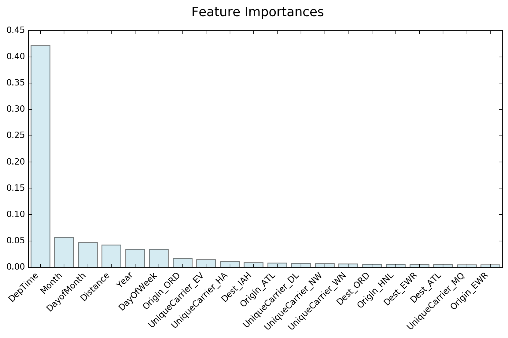
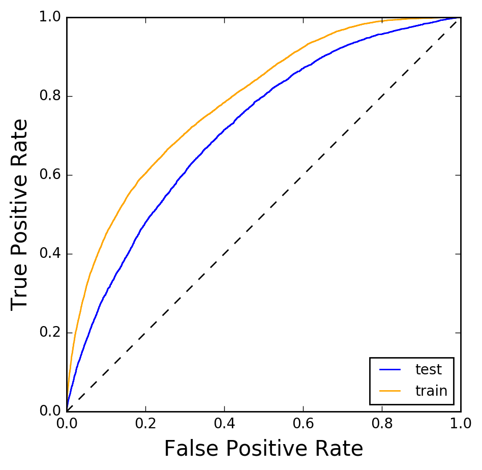
Figure 7: Receiver Operating Characteristic for the random forest classifier used to predict flight delays. The curve is shown both for the training data set (orange) and the testing data set (blue).Figure 6 shows that departure time is by far the most important feature, in agreement with the intrinsic discrepancy calculation shown earlier.
The last plot I’d like to show is that of the Receiver Operating Characteristic (ROC). This is a plot of the true positive rate versus the false positive rate, and is shown in Figure 7. The orange curve is the ROC calculated on the data set on which the random forest was trained, whereas the blue curve was obtained from the testing data set. The area under the orange ROC is 0.786, that under the blue ROC 0.717. The fact that both curves are not too far from each other indicates that there is little overfitting.
Technical note
The Jupyter notebook for this analysis can be found in my GitHub repository RandomForests.