Forecasting Wind Power
April 30, 2017
[Revised 9 January 2020]
Contents:
1. The Hackathon's Challenge
2. The Wind Turbine Data Set
3. Random Forest Analysis
4. Gradient Boosting with XGBoost
5. A Generalized Linear Model
6. Summary and Private Leaderboard
7. Technical Note
On July 19 and 20, 2016, the H2O Open Tour came to the IAC building in New York City to present their product and foster community with the help of tutorials, talks, social events, and a hackathon. The hackathon was interesting, so that I (sporadically) continued working on it after the conference. This post summarizes my findings.
The Hackathon’s Challenge
The challenge was to predict the power output of an array of ten wind turbines using nearby wind velocity measurements. Each turbine was associated with a wind station that delivered four measurements: zonal and meridional wind velocities at heights of 10 and 100 meters above ground (the heights of the turbines themselves were not provided).
The entire hackathon data set contained 168,000 hourly measurements made between January 1, 2012 and December 1, 2013 (100 weeks). Each measurement consisted of one turbine power output, plus the four associated wind measurements, plus a time stamp. Here is how the data set was split into training and testing parts:
Table 1: Data sets used for the H2O hackathon in July 2016. The two leaderboard data sets were used for testing and did not reveal turbine power outputs.
| Data Set | Data-Taking Period | Number of observations |
|---|---|---|
| Training | 01/01/2012 - 07/31/2013 | 138,710 |
| Public Leaderboard | 08/01/2013 - 09/30/2013 | 14,640 |
| Private Leaderboard | 10/01/2013 - 12/01/2013 | 14,650 |
The performance measure used to evaluate contributions was the root-mean-square error (RMSE), i.e. the square root of the average squared difference between predicted and observed turbine outputs.
At the hackathonA note about terminology: to train models I split the hackathon training data set into a subset for training (typically via cross-validation) and a subset for testing. For brevity I will refer to “the training (or testing) subset of the hackathon training data set” as “the training (or testing) subset”. I will also abbreviate mention of “the entire hackathon training data set” into “the training data set”. I tried a random forest, which gave decent results. Later I improved on these by doing some feature engineering and using a more powerful learning algorithm. In the remainder of this post I describe the data set, feature engineering, and results obtained with a random forest and the gradient boosting algorithm known as XGBoost. I also try a generalized linear model based on a simplified information set; this gives surprisingly good results. I finish with a summary and technical note.
The Wind Turbine Data Set
The data setTao Hong, Pierre Pinson, Shu Fan, Hamidreza Zareipour, Alberto Troccoli and Rob J. Hyndman, “Probabilistic energy forecasting: Global Energy Forecasting Competition 2014 and beyond”, International Journal of Forecasting, vol.32, no.3, pp 896-913, July-September, 2016. was originally provided on the Energy Forecasting blog of Dr. Tao Hong.
Each data record contains the following fields:
Table 2: Features of the wind turbine data set. The zonal and meridional wind velocities are orthogonal vector components, so that their sum in quadrature equals the magnitude of the horizontal wind velocity. The response variable of interest is TARGETVAR.
| Feature | Description | |
|---|---|---|
| 1. | ID | Measurement ID |
| 2. | ZONEID | Zone id: an integer between 1 and 10 |
| (A zone comprises one wind turbine and | ||
| one wind velocity measurement station.) | ||
| 3. | TIMESTAMP | Date and time of measurement |
| 4. | TARGETVAR | Turbine power output, a number between 0 and 1 |
| 5. | U10 | Zonal wind velocity 10 meters above ground |
| 6. | V10 | Meridional wind velocity 10 meters above ground |
| 7. | U100 | Zonal wind velocity 100 meters above ground |
| 8. | V100 | Meridional wind velocity 100 meters above ground |
As mentioned earlier, there are ten turbines. Turbine power outputs are normalized to their nominal capacities, making TARGETVAR a number between 0 and 1. A histogram of TARGETVAR in the training data set is shown in Figure 1.
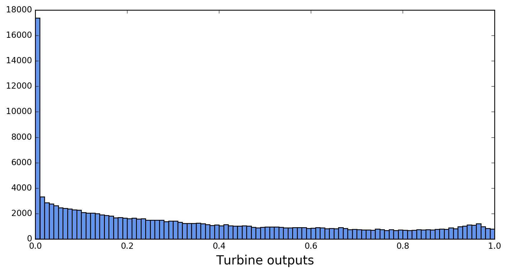
The spectrum displays two noteworthy features: a large spike near 0, and a bump near 1. The bump corresponds to turbines working near full capacity. The large spike correlates with low wind velocities. Turbines won’t produce any power if the wind speed falls below a threshold known as the cut-in speedFor some basic explanations of the workings of wind turbines, see the Windpower Program website. . The fraction of turbine outputs that are exactly zero is 8.5% for all turbines combined, but varies from 2.4% for turbine 2 to 17.0% for turbine 9.
Figure 2 illustrates the effect of the cut-in speed for turbine 9. Each dot in this figure is the tip of a horizontal wind velocity vector with tail at (0,0). Orange dots correspond to zero turbine output and congregate at low wind velocities. Blue dots correspond to non-zero turbine output and form a donut shape around the orange ones.
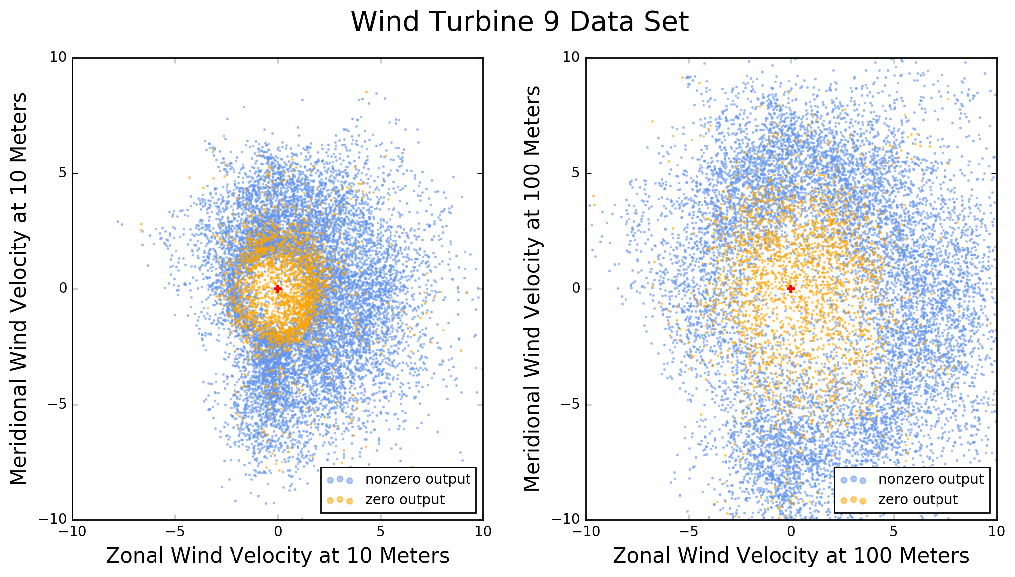
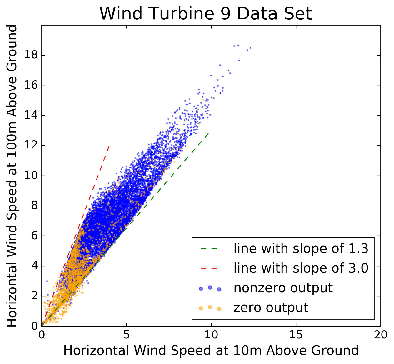
Figure 3: Scatter plot of horizontal wind speed at 100m above ground versus that at 10m above ground, in zone 9. (The wind speed units are unknown.) Note how wind velocities tend to be higher at 100m than at 10m. The simplest model for vertical wind profiles is a power law, according to which the ratio of wind speeds at two different heights is a constant. Figure 3 illustrates this model by showing horizontal wind speeds measured at 100m above ground, versus 10m, in zone 9. The model is not very good for the data at hand. The ratio between the two wind speeds in the figure varies between about 1.3 and 3.0, suggesting that knowledge of the wind speed at one height provides only limited information about wind speed at another height.
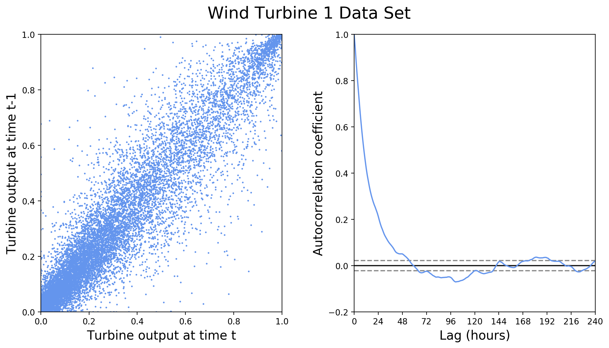
Since the measurements were taken at one-hour intervals, they are serially correlated. Figure 4 illustrates this correlation for the turbine-1 power output.
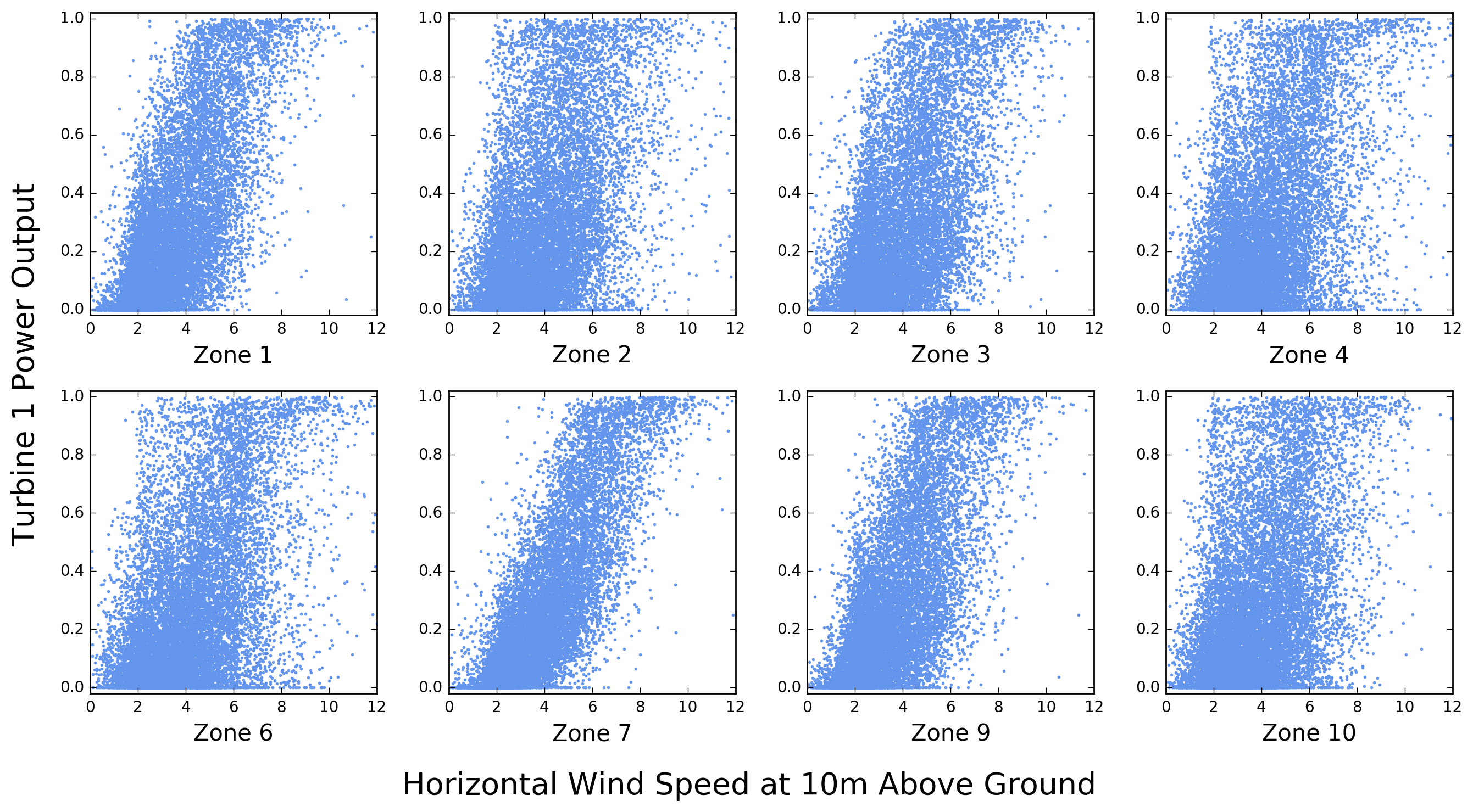
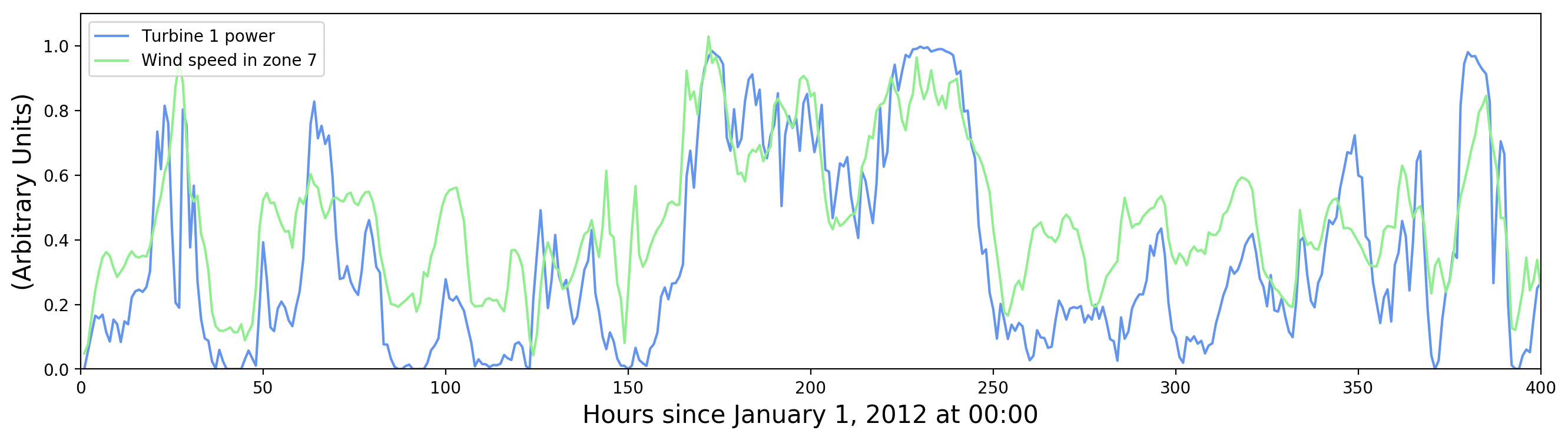
Although the data set is structured in such a way that each record associates one of ten turbines with only one set of wind velocity measurements (U10, U100, V10, and V100), it is instructive to see how the power output of a given turbine correlates with wind measurements near other turbines. This is shown in Figure 5 for turbine 1. Note that for this turbine the strongest correlation appears to be with wind speeds measured near turbine 7.
Let’s look at this more closely. How do turbine power and horizontal wind speed vary as a function of time? This is shown in Figure 6. Peaks in wind speed correspond to peaks in turbine power, and the effect of the cut-in speed is also visible (periods of zero turbine output associated with low, but non-zero wind speed).
There is also evidence of small random fluctuations on top of broad patterns. Presumably only the broad patterns are significant, being induced by actual changes in wind speed, and the small fluctuations are measurement errors. For improving turbine output predictions it may help to average out the small fluctuations in measured wind speed, but the fluctuations in measured turbine output represent an irreducible limit on predictability.
This brief exploration of the data set suggests some strategies for analysis:
-
Use all wind measurements for predicting each turbine output. Since there are eight wind velocity measurement stations and four measurements per station, this yields 32 features for predicting turbine output.
-
From the time stamp it may be useful to extract separately year, day of the year, and hour. This could help tease out effects due to daily and seasonal wind patterns. Once we extract time stamp components, two issues arise w.r.t. training models. The first one is data type: are time stamp components numerical or categorical, and how should they be presented to the model? Should we apply one-hot encoding? The second issue is the cyclical nature of the hour and day features. Hour 24 of one day is adjacent to hour 1 of the next day, just as day 365 of one year is adjacent to day 1 of the next year. Should we transform these features to make this adjacency numerically true, and if so, how?
-
Since the observed wind speeds exhibit fluctuations due to measurement error (Figure 6), we may be able to improve precision by computing a rolling window average. In other words, to predict turbine output at time t, use an average of wind speed measurements at times t, t-1, t-2, etc. Exactly how many measurements to include should be determined by looking at the desired performance measure, i.e. the RMSE. Note that if we compute a rolling window average and then randomly split the dataset into training and testing subsets, measurements in the testing subset may be correlated with measurements in the training subset. For example, if we average over three measurements, it is possible that for some t the average of t-1, t, t+1 belongs to the training subset, whereas the average of t, t+1, t+2 belongs to the testing subset. The same problem arises with k-fold cross-validation. A possible solution is to do time-series splitting.
-
How should we handle the peak at zero turbine output? Would it help to split the machine learning problem into a classification first (zero turbine output versus nonzero turbine output), followed by a regression on the nonzero outputs?
Random Forest Analysis
In random forest regression one is averaging a large number of regression trees. Each tree is trained on a resampled version of the training data set, and each tree node is split on a random subset of the features. I tried two methods for presenting the data to the model:
-
Method 1 is to transform the data so that each record contains all 32 wind speed measurements made at a given timeThe original data set contains all 32 wind velocity measurements made every hour during the data-taking period. These measurements are spread out over different records but there are no missing data. . One can also put the 10 measured turbine outputs in each record, making the prediction target a 10-dimensional vector. The
scikit-learnpackage can handle multi-dimensional targets, but others (e.g. XGBoost) can’t. In that case I used ZONEID to split the data set into ten subsets, one per turbine, which I modeled independently. -
Method 2 is to leave the given structure of the data in place (four wind measurements per record), but to convert ZONEID into a categorical variable and apply one-hot encoding to it. This yields nine binary variables, each one indicating whether or not TARGETVAR represents the power output of the turbine in the corresponding zone.Technically there are ten binary variables, one per turbine, but the first one is deleted to avoid redundancy (since it corresponds to the nine remaining variables being zero). At most one binary variable can be “on” in any given record.
It should be obvious that method 1 allows the modeling of correlations between a given turbine output and wind speed measurements in other zones, since each record in the transformed data contains all the wind measurements. Such correlations are not modeled with method 2, but this may not matter because the model will be evaluated based on a root mean squared error averaged over all ten turbines.
Note also that method 1 produces a dataset of 13,871 records, each of which contains 35 predictors ( wind measurements plus 3 time features: year, day of year, and hour). By contrast, method 2 produces a data set of 138,710 records, each with only 16 predictors (4 wind measurements, 9 zone id flags, and 3 time features). From the point of view of training a machine learning algorithm, method 2 may have an advantage — more data records, fewer predictors per record — that makes it easier to optimize. As a matter of fact, method 2 gave somewhat better results (see below).
Another optimization involved implementing a rolling average of wind measurements to predict turbine output. To select the window size of this rolling average, I tried including 1, 2, 3, and 4 measurements in the average. The best RMSE on the test subset was obtained with 3 measurements. Cross-validation was performed with standard K-fold splitting (not time-series splitting).
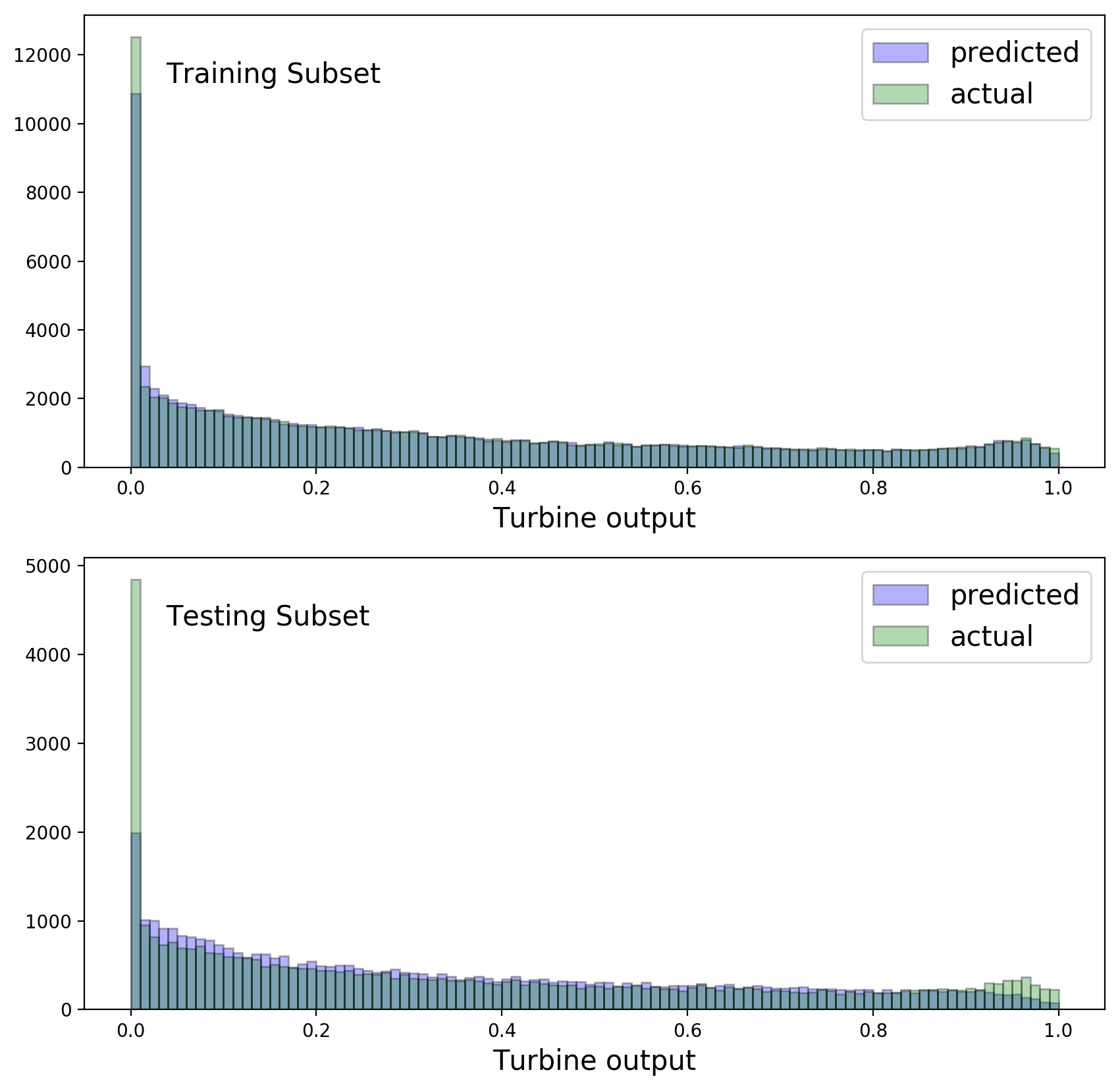
It is instructive to compare predicted and observed turbine output distributions for Method 2, separately in the training and testing subsets:
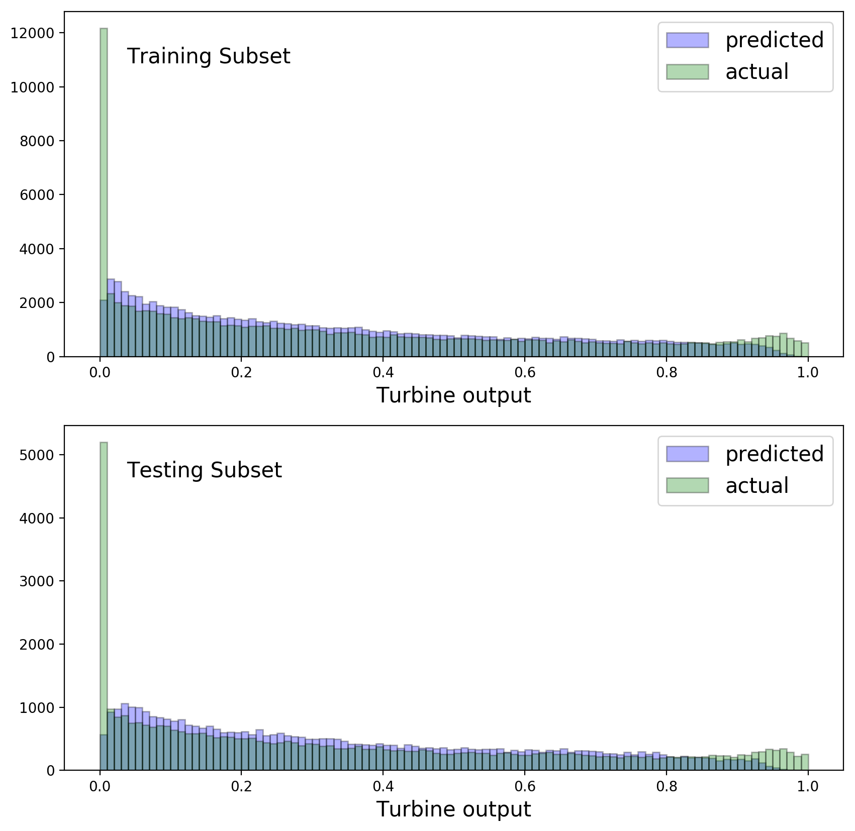
The random forest models don’t do a very good job of modeling the spike at zero output, or the bump near one. This is shown above for Method 2, but is also true for Method 1.
For method 1, the public leaderboard of the hackathonAfter the hackathon I gained access to the measured turbine powers (as fractions of total capacity) for the public and private testing data sets, see side-note 2. yields:
and for method 2:
In an attempt to improve on these numbers I’ll use a more powerful machine learning algorithm in the next section. Also, I’ll be using method 1 from now on in order to avoid dealing with the ZONEID categorical features.
The following couple of plots show the feature importances in Methods 1 and 2:
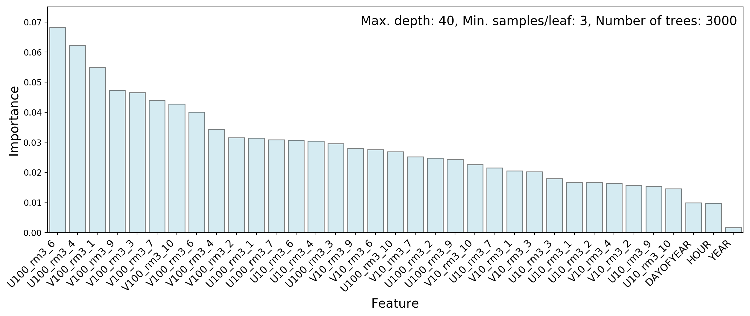
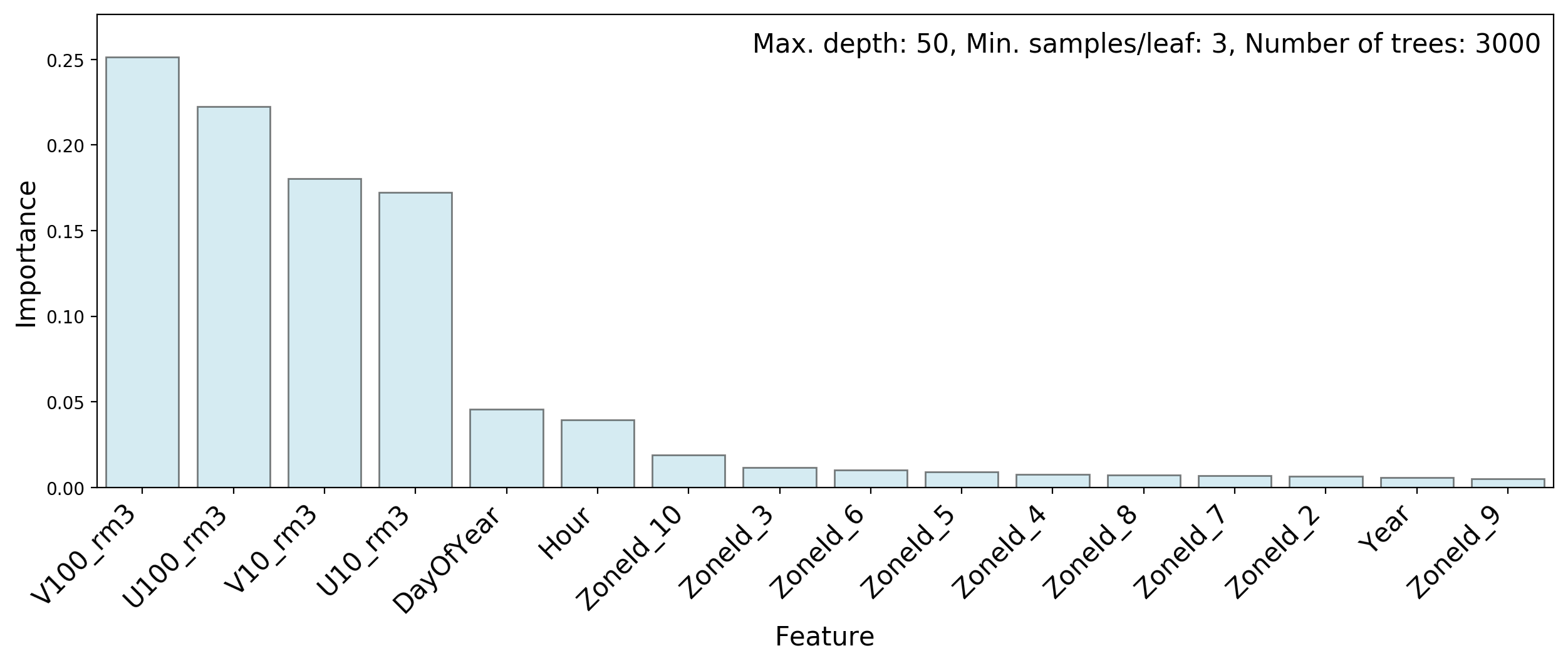
Wind speeds are more important than measurement dates or times, but no single feature stands out by itself.
Gradient Boosting with XGBoost
In gradient boosting models, a weak learner is improved by the sequential addition of more weak learners. Each learner in the sequence focuses on instances that are not well modeled by the previous learner. To understand how this might workSee this blog post by Ben Gorman for an insightful introduction to gradient boosting. , consider a regression model for example. The first weak learner attempts to fit the response variable directly, whereas the second weak learner tries to model the residuals of the fit by the first one. Thus the sum of these two learners should be better than the first one alone. The idea of boosting is to keep adding weak learners in this fashion until no further improvement is obtained. In practice, learners in gradient boosting models attempt to model the gradient of a loss function. This is more general than residuals and therefore more useful. Typically, shallow trees are used as weak learners, but the algorithm works with any kind of weak learner.
One of the most popular and powerful implementations of gradient boosting is XGBoostTianqi Chen and Carlos Guestrin, “XGBoost: A scalable tree boosting system”, KDD 2016 Proceedings of the 22nd ACM SIGKDD International Conference on Knowledge Discovery and Data Mining, pages 785-794 (San Francisco, California, USA, August 13-17, 2016). . This package has already been used with much success in several Kaggle competitions. It supplements the basic gradient boosting algorithm with regularization, shrinkage (via a learning rate), data and feature subsampling, and a number of computational optimizations.
Proper tuning of the hyperparameters of XGBoost requires some exploration, but is fairly straightforward. I optimized each turbine separately on a hyperparameter grid, using five-fold cross-validation. For each turbine the training features consisted of all 32 wind speed measurements as well as the year, day of the year, and hour of the observations.
Figure 10 compares observed and predicted turbine output distributions in the training and testing subsets.
Note how, in the training subset, modeling of the spike at 0 and the bump near 1 is significantly better than with the random forest models. Unfortunately this does not generalize quite as nicely to the testing subset, which hints at overfitting. In spite of this problem I computed the performance measure for XGBoost on the test set of the public leaderboard of the hackathon. This yielded
For the record, Figure 11 shows a plot of feature importances, averaged over all turbines.
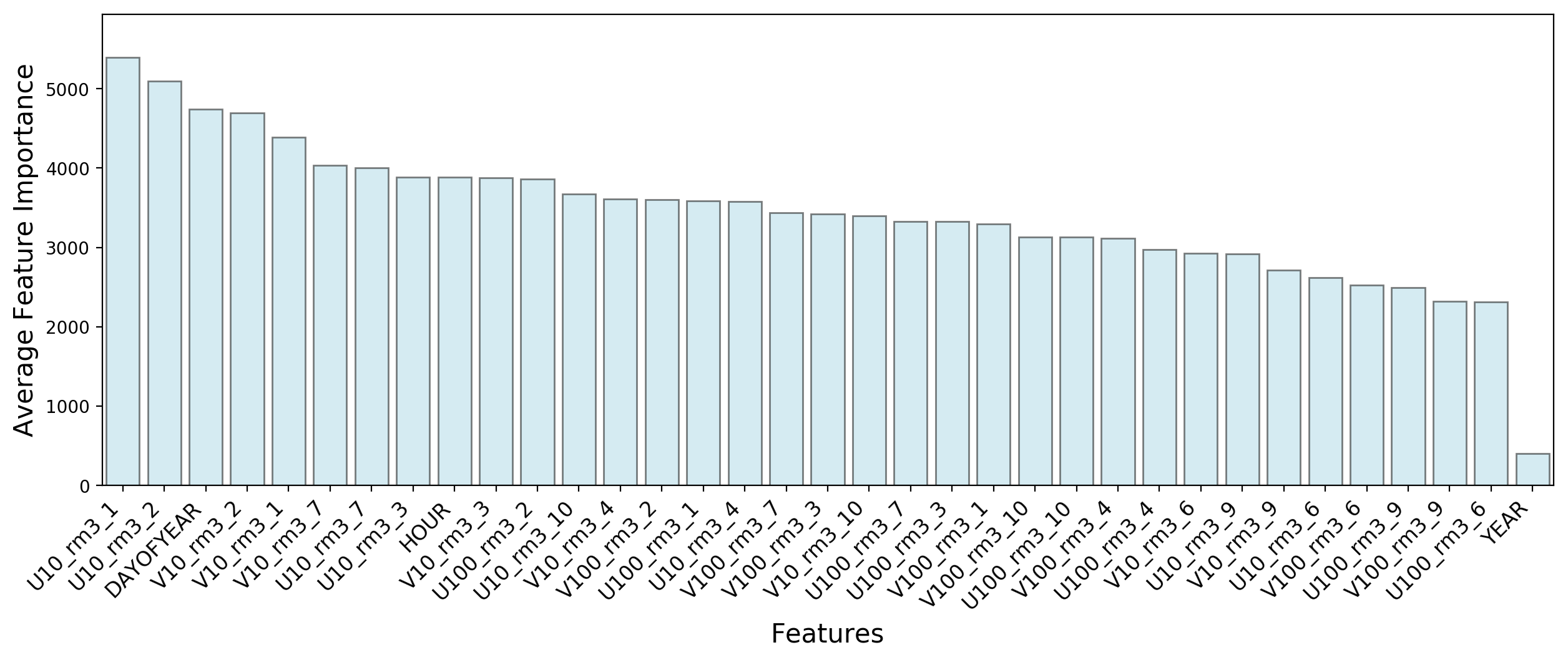
XGBoost makes better use of the “DAYOFYEAR” and “HOUR” features than the random forest models. Here for example, “DAYOFYEAR” is the third most important feature, whereas in random forest models it scores below all the wind velocity measurements.
As suggested earlier, I tried to improve on this result by first classifying turbine outputs as either “equal to zero” or “greater than zero”, and then performing a regression on the latter outputs. Both steps were performed with XGBoost, but no improvement was obtained.
A Generalized Linear Model
For predicting the power output of a wind turbine, one could argue that the only features that matter are the magnitudes of the horizontal wind velocities near the turbines. The directions of the wind velocity vectors shouldn’t matter since a turbine always orients itself to maximize its capture of wind power. The timing of wind measurements could add some useful information due to the cyclic nature of daily and seasonal wind patterns, but this is not expected to be a major effect. By taking the wind velocity magnitudes as the only predictors, it should be possible to simplify the prediction model considerably and perhaps gain some interpretability. The resulting model may not perform better however, since turbulence effects distort wind speed measurements as well as the generation of turbine power.
Ideally one would like to use a linear regression model, but this won’t work here since the response variable is bounded between 0 and 1. A generalized linear model with a two-parameter beta distribution for the response variable is a better option. Unfortunately the beta distribution does not assign finite probabilities to the boundaries 0 and 1, and in the problem at hand we have a large peak at 0 as well as a few instances at 1 (see Figure 1). A possible solution is to use the so-called “beta inflated distribution”: a mixture of a beta distribution, a peak at 0, and a peak at 1. As far as I know, only R provides a package that can handle this problem, namely GAMLSS, which stands for “Generalized Additive Models for Location, Scale, and Shape”.
First a word about GAMLSS. This is a very general framework for regression models. In ordinary linear regression the response variable has a normal distribution; its mean is a linear function of the predictor variables and its width is constant (homoscedasticity). In GAMLSS the response variable can have almost any distribution, discrete or continuous, and all the parameters of the response variable distribution (not just the mean) can be modeled via sums of functions (not necessarily linear) of the predictors.
Generalized additive models have the advantages over tree models that they are not random, and that they are faster to train (fit).
To keep things simple, I only used GAMLSS to obtain a generalized linear model. In this type of model, any parameter of the distribution of the response variable can be related via a one-to-one link function to a linear combination of the predictors . Let’s start with the distribution of . As mentioned earlier, I used a beta inflated distribution:
where are probabilities and are the beta distribution parameters. In what follows it will be convenient to use an alternative parametrization of this distribution:
Next, I linked two parameters of this distribution to linear combinations of the predictors. The first one is the mean of the beta component of the distribution:
where the are fit coefficients and the are the predictors (the 16 horizontal wind velocity magnitudes in our problem). The link function must map a number between 0 and 1 to the entire real line. A standard choice for this is the logit function:
The second parameter I linked is the combination of peak probabilities:
The link function maps a positive number to the real line. A standard choice for this is the natural logarithm:
In this way I linked two out of the four parameters of the beta inflated distribution. The remaining two parameters, and , are assumed independent of the predictors.
The GAMLSS fitter then uses the entire training subset to produce fitted values for the coefficients and , as well as for and .
Finally, given the fitted coefficients, the link functions and , and an instance from the training or testing subset, one can predict values for all four parameters of the distribution of . The predicted value of is then given by:
Figure 12 illustrates the performance of this model on the training and testing subsets. In both cases two plots are shown: the predicted turbine output distribution superimposed on the observed one, and a QQ plot. The QQ plot is a convenient way to check residuals in the case of a non-Gaussian response variable distribution. For a good fit the points on the QQ plot line up along the diagonal.
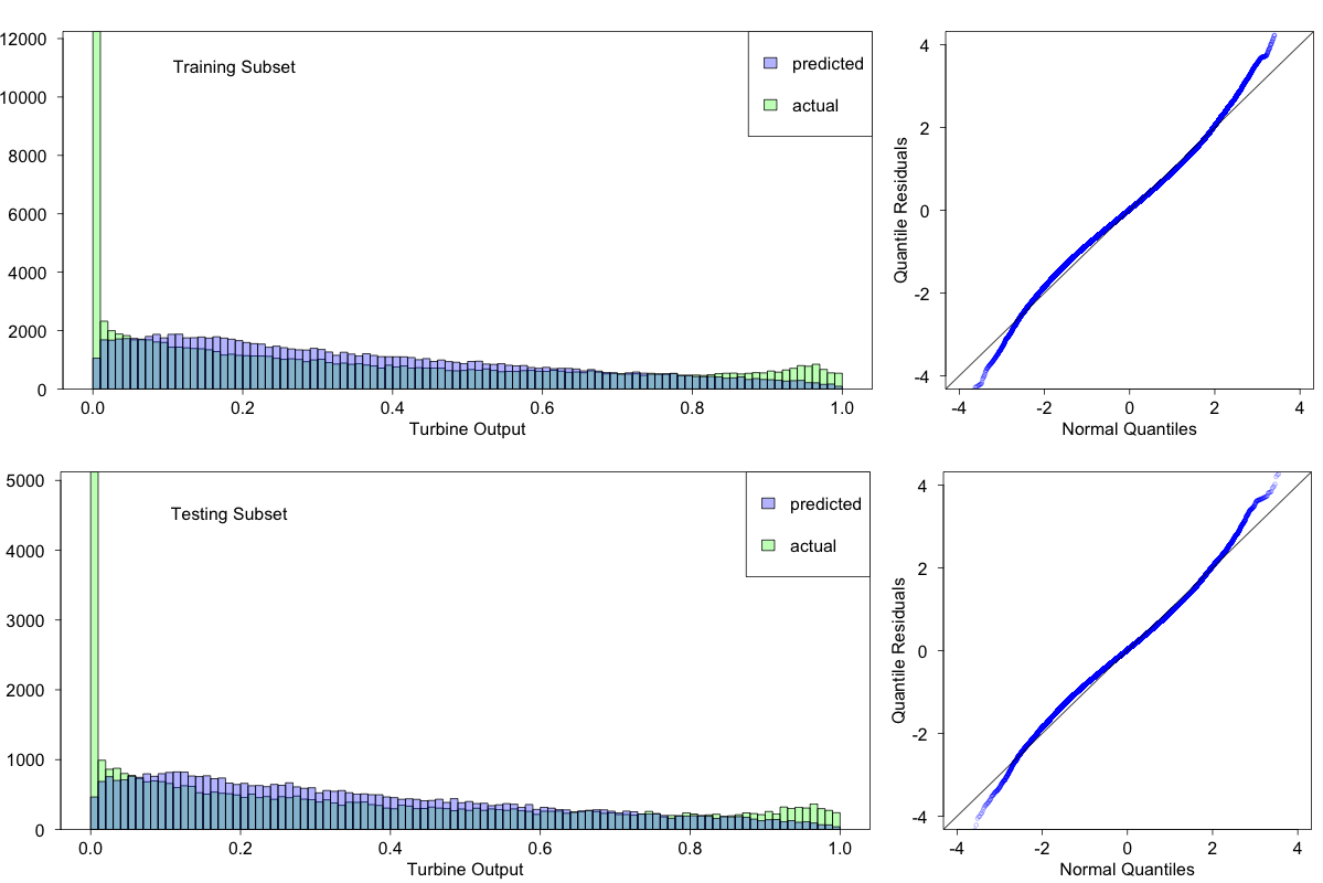
The fits are not very good; they fail to capture important features at both ends of the turbine power spectrum. However the fit to the testing subset does not appear to be worse than that to the training subset, suggesting that whatever features do get captured will generalize.
Here is the root-mean-square error for the public leaderboard of the hackathon:
This is comparable to the results obtained with random forest models.
Summary and Private Leaderboard Results
Table 3 summarizes the root-mean-square errors obtained for the four models on the public leaderboard of the hackathon.
Table 3: Root-mean-square errors on the public leaderboard for the models described in this post.
| Model | Public Leaderboard |
|---|---|
| Random Forest 1 | 0.180311 |
| Random Forest 2 | 0.167223 |
| XGBoost | 0.167607 |
| GAMLSS | 0.167303 |
Suppose that the hackathon was still going on, and that you had to choose a model for the (hidden) private leaderboard. Which one would you choose? The winner gets an iPad and a job offer at H2O…
Based on the public leaderboard one could go with either Random Forest 2 or GAMLSS, or even XGBoost. Tough choice? Unfortunately hindsight only adds to the difficulty. Take a look at the private leaderboard:
Table 4: Root-mean-square errors on the public and private leaderboards for the models described in this post. These numbers can be compared with the top private leaderboard score obtained by the winner of the hackathon: RMSE=0.169463.
| Model | Public Leaderboard | Private Leaderboard |
|---|---|---|
| Random Forest 1 | 0.180311 | 0.178977 |
| Random Forest 2 | 0.167223 | 0.174105 |
| XGBoost | 0.167607 | 0.168778 |
| GAMLSS | 0.167303 | 0.176077 |
Random Forest 2 and GAMLSS, the top two winners on the public leaderboard, don’t do so well on the private leaderboard, where XGBoost is the clear winner.
There is a way to improve even further on these results, by a technique known as stacking, where the outputs of several models are used as input to a new model. For simplicity we will choose as new model one that predicts the average of its inputs. We will only use our top three models as inputs: Random Forest 2, XGBoost, and GAMLSS. The result is in the table below:
Table 5: Root-mean-square errors on the public and private leaderboards for all models, including the final stacking model, which averages the outputs of Random Forest 2, XGBoost, and GAMLSS.
| Model | Public Leaderboard | Private Leaderboard |
|---|---|---|
| Random Forest 1 | 0.180311 | 0.178977 |
| Random Forest 2 | 0.167223 | 0.174105 |
| XGBoost | 0.167607 | 0.168778 |
| GAMLSS | 0.167303 | 0.176077 |
| Stacking | 0.157353 | 0.164689 |
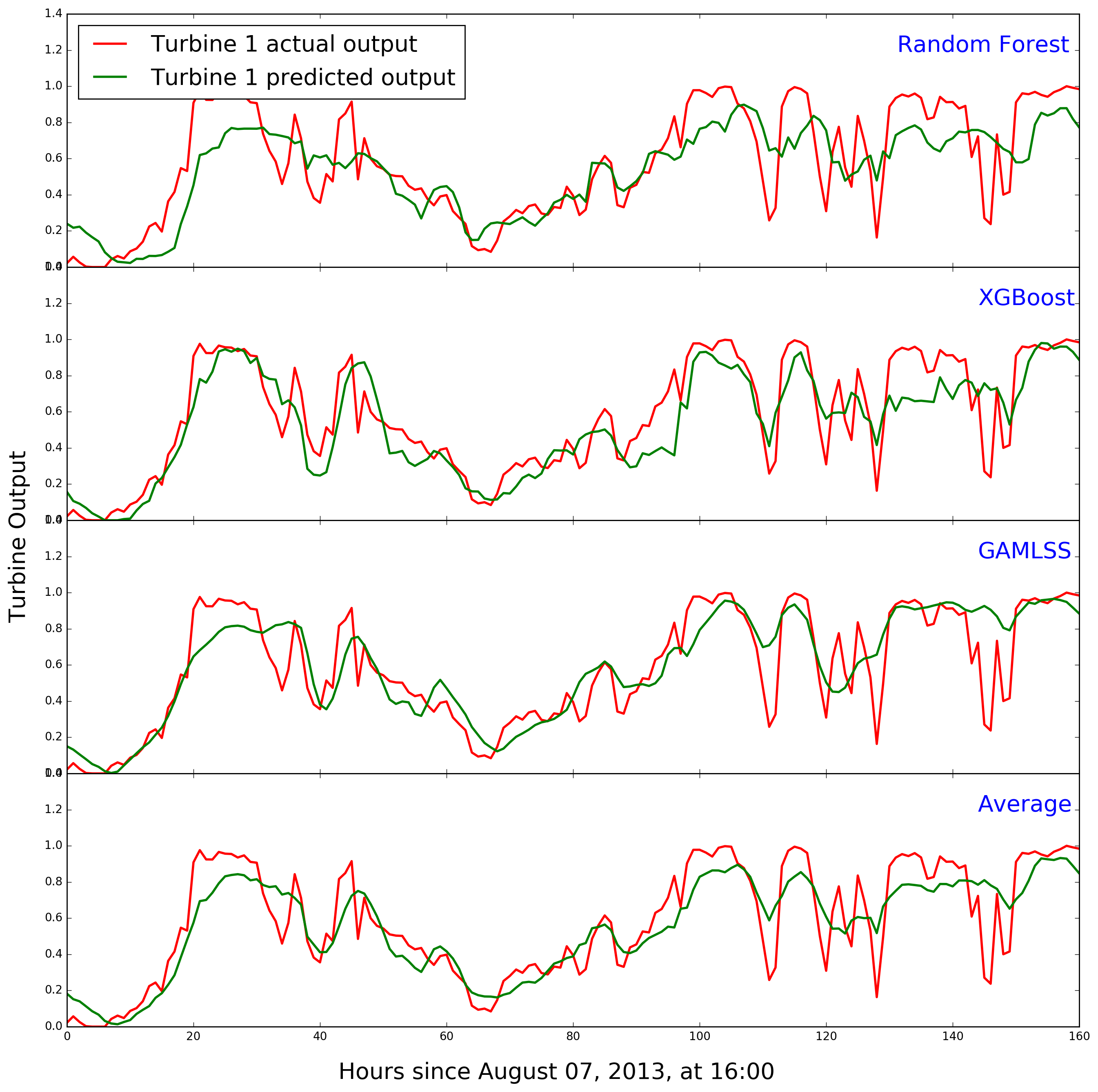
Figure 13 compares predicted and actual turbine 1 power during the second week of the public leaderboard for the bottom four models.
Here are some lessons that can be drawn from the whole exercise:
-
A machine learning algorithm may perform differently depending on how the data are presented to it. This is the only difference between random forest models 1 and 2. The latter is clearly better than the former on the testing set, but this is most likely due to the way the performance measure is constructed (by averaging the RMSE over all turbines).
-
XGBoost is remarkable in its ability to model “singular” features such as the peak near zero turbine output. This is probably because of the way gradient boosting works, each tree acting mostly on instances mismodeled by the previous trees. In contrast, a random forest averages the results of independent trees, and this must have a smoothing effect on singularities. A similar effect is at work with generalized linear regression models (see the equation for in the section on GAMLSS: can never be exactly zero since it is a weighted average over the three components of a mixture.) Unfortunately, XGBoost’s ability to model singularities in the training data set was partially the result of overfitting.
-
Generalized linear models are very fast to train, but there may be a tradeoff to consider between training speed and modeling performance.
-
One way to take advantage of time series such as the hourly wind speed data set is to compute a rolling window average to smooth out random fluctuations. Here I used a simple arithmetic average over three consecutive measurements. However, a weighted average might make more sense, where older measurements are weighed down compared to recent ones. One option is the so-called Exponentially Weighted Moving Average, implemented by the function
ewm()in pandas.
Technical Note
Python and R Jupyter notebooks for this analysis can be found in my GitHub repository WindTurbineOutputPrediction.